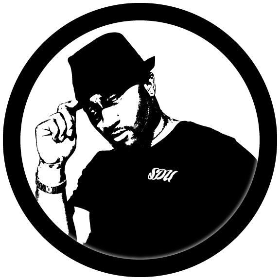
was really getting into DJ'ing and he started getting booked at a few places. When those places had flyers he no brand statement to advertise himself other than his name. He came to me with a sketch/drawing of what he would like his logo to look like if he ever decided to have one. The idea was simple... It was a direct illustration of what he looked like, let me explain, at the time he had a high top fade haircut with a medium brown streak in the front, small cuts in the side, and you would usually see him with shades on. This was great because this was his form of branding, he was unique and he stood out because of these features.
He drew a character of himself with the word "Wrecck" under it, that was his moniker at the time. This may sound crazy but when he showed me the drawing one aspect of made me say, "Give it to me, I want to vectorize it"... that one aspect is the shape of the upward curve in the hair, something about that shape interested me enough to want to design this logo.
The vectorizing phase was pretty basic because the shapes were easy to make but there were subtle differences I decided to make. I wanted the high top fade to be a little higher to emphasize how tall it was in real life and the shape of the glasses, I felt they should be more of a rounded square shape rather than the circular shape because I wanted to keep the consistency of the shape we started with in the hair. The typography was a simple font with slight changes and stretches to make it closely mimic the original text in the drawing.
When I showed him the black and white logo design he immediately loved it, so I just added the colors which was easy because it was just based on the actual color of his skin and the part in his hair. This logo is little over two years old I think and I still love how basic the shapes are but they reflect a person in such detail.
* credit: original hand drawn art by DJ Wrecck


